

Components
A component is a group of frames you use more than once in a template: a price badge, a title block, a product card. You make it once; each place it appears is an instance of it. Change the component and every instance follows.
A component belongs to its template. It isn’t shared between templates or kept in a brand kit.
Make a component
Section titled “Make a component”- Select the frames that make it up, for example a shape and the price on it.
- Right-click one of them and choose Make component… from its menu.
- Give it a name, and click Make component.
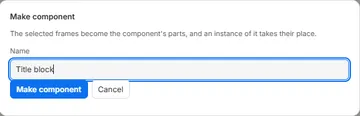
The frames become the component’s parts, and an instance of it takes their place on the page. Nothing moves: the instance’s box is the box around the frames. A component can’t hold another component’s instance.
Place it again
Section titled “Place it again”The Components list at the bottom of the Layers tab shows each component of the template and how many instances it has. Place puts a new instance in the middle of the page, at the component’s size; move it from there.
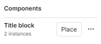
In the layers list, an instance has a component icon. Copying an instance, to this template or another, takes its component with it; a different component of the same name in the other template is kept, and the pasted one gets a number.
An instance
Section titled “An instance”On the page, an instance is one frame: move it, resize it, rotate it, anchor it, wrap text around it, hide it or lock it as any other. Its Opacity fades its parts together. Resizing it doesn’t stretch its parts: they are laid out again inside its new box, following their own anchors and auto-size. A part that ends up outside the box gets a warning in Checks.
Select an instance to see its Component section:
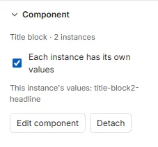
- Edit component changes the parts (below).
- Detach turns this instance into ordinary frames of the page, where they are, named after it (
title-block1-headline). It no longer follows the component.
Fields in a component
Section titled “Fields in a component”The fields a component’s parts show are the template’s own fields, listed in the Data tab. By default every instance shows the same values: a {{price}} in the component shows the same price everywhere, as it would in any other frame.
When each instance needs its own values, for example two products with two prices, tick Each instance has its own values. It applies to all the component’s fields at once. Each instance then has its own copy of every field the parts use, named after it: promo1-price and promo2-price. These are the names an integrator sends, so tell them when you turn it on or off.
- Placing an instance adds its fields; deleting it removes them, after asking.
- Renaming an instance renames its fields, so its name must be usable in a field name: letters, digits,
_and-. - Turning it off again asks first: the instances then share one value, the first instance’s sample.
Edit a component
Section titled “Edit a component”Double-click an instance, press Enter with it selected, or click Edit component. Its parts become the page you edit, in place: the rest of the page is faded and can’t be selected, and a rotated instance is shown upright while you edit it.
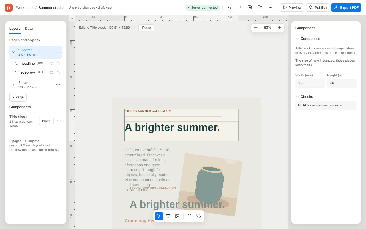
Everything you change here changes every instance: move or restyle a part, retype its text, add a frame, delete one. Undo works as anywhere else.
- In a part’s anchors, Component stands for the instance’s box (where it says Page on a page), and To component aligns to it.
- With nothing selected, the Component section sets the component’s own Width and Height: the size new instances get. The instances already placed keep their size.
Click Done, or press Esc with nothing selected, to go back to the page.
Delete a component
Section titled “Delete a component”In the Components list, choose Delete in its ⋯ menu (Actions for Title block), or right-click its row. If it has instances, the editor asks first, then turns each into ordinary frames where it is, as Detach does.
Share it with other templates
Section titled “Share it with other templates”A component can join your organisation’s brand kit, with Add to brand kit in its ⋯ menu. Every template linked to the kit can then place it, and follows it when it changes.
Good to know
Section titled “Good to know”- A component’s parts can’t include an instance of a component.
- An instance’s look (fill, stroke, shape) is its parts’: its Appearance section has only Opacity.