

Fields
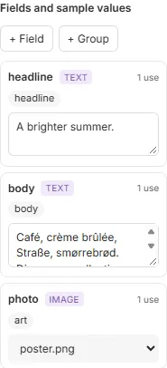
A field is a part of the template that each document fills in: a name, a price, a photo. Each document made from the template gives a value for each field. While you design, a sample value stands in for it, so you can see how real content fits.
Fields are in the Data tab, on the left.
Add a field
Section titled “Add a field”- In the Data tab, click + Field and choose its kind: Text, Number, Choice, Switch or Image (see Kinds of field).
- Type its Name and press Enter.
- Give it a sample value under its name: type it, pick it, tick it, or choose a sample image.
A field’s name is how the template refers to it, and how the documents’ values are matched to it. It can have letters, digits, _ and -, and no spaces.
Use a field
Section titled “Use a field”- In text: while editing a text frame, put the caret where the value goes and choose the field in Insert field in the text section, or from Field in the tools at the bottom of the canvas. The value joins the text around it, in its formatting. Text, number and choice fields go in text. See Text.
- As an image: select an image frame and choose the field in its Image menu, for example Field: photo, or from Field in the tools. See Images.
Each field’s row says how many times it’s used. Under it, the frames using it are listed: click one to select it.
Kinds of field
Section titled “Kinds of field”- Text: any words, a line or a paragraph. The usual kind.
- Number: a price, a percentage, a quantity. In text it shows with its decimals and a point: a price with 2 decimals shows
2.80. - Choice: one of a fixed list, such as a region or a size. In text it shows the option’s label.
- Switch: on or off, to show or hide something. It never shows in text, and putting one there is an error in Checks. Showing and hiding content with switches comes in a later version; until then a switch only takes its values.
- Image: a picture for an image frame.
A field’s Type can change. While text uses it, it can only become another kind that shows in text, text, number or choice, and its sample goes with it when it fits: 12 stays 12 as a number, France becomes the option labelled France. A sample that doesn’t fit is cleared.
Choice
Section titled “Choice”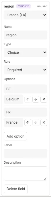
A choice field’s Options each have a value, what documents send (FR), and a label, what the text shows (France); without a label, the value shows. Add option adds one; the arrows move one up and down, × removes it. The field’s sample and default are picked from its options, and renaming an option’s value takes them with it.
Number
Section titled “Number”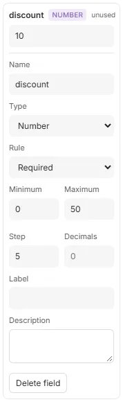
A number field may have a Minimum and a Maximum, and Decimals, how many digits after the point it shows and takes (none to start with, up to 6). Step is how much the arrows of its box add or take away. A sample outside the range, or with more decimals, is refused as you type, saying why.
Groups
Section titled “Groups”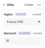
Groups sort a template’s fields, so whoever fills them in finds them together, as your organisation’s order form will. Click + Group, type its name and press Enter; then open a field and choose the group in its Group menu.
Click a group’s name to fold it away and again to unfold it; the editor remembers which are folded. Its ⋯ menu Renames it, moves it (Move up, Move down) or Deletes it, keeping its fields. A component instance’s own fields are listed under the instance’s name.
Show field names
Section titled “Show field names”To see at a glance which content comes from fields, click Show field names in the tools at the bottom of the canvas, press CtrlShiftF, or tick it in Settings… → View. Each field in text then shows its name in braces where its value goes, tinted, and an image frame showing a field is tagged with its name.
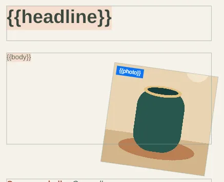
You can edit text as usual in this view. It changes only what the canvas shows: Checks, the page thumbnails, Preview and exports still use the values. The editor remembers the setting in this browser.
Rules for values
Section titled “Rules for values”Open a field to set what its values must be:
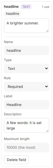
- Type: one of the kinds.
- Rule: Required, every document must give a value; or Optional, with a default, used when a document gives none. The default can be empty.
- Label and Description: a friendly name for the field and a note on what to give, for whoever fills it in, for example in your organisation’s order form.
- Maximum length, for text: the most characters a value may have, up to 10,000.
A text value is plain text: a new line in it starts a new line in the frame, and a tab goes to the next tab stop. A value that breaks the rules is refused before a document is made, naming the field.
Sample values
Section titled “Sample values”The sample values are the template’s own example content: the editor shows them, and an export or preview from the editor uses them. Give each field a sample like the real content, long names included, so that you see where text doesn’t fit before a document does.
Clearing a required field’s sample is an error in Checks, “Missing required field”, and marks the field’s row. Click the error to go to the field. An optional field without a sample shows its default.
Typing in a sample is undone a word at a time.
Delete a field
Section titled “Delete a field”Open the field and click Delete field. When frames use it, the editor asks first, then keeps the field’s current sample in those frames as fixed content.
Good to know
Section titled “Good to know”- Each field’s name is unique in the template.
- A sample must keep the field’s rules: a maximum length shorter than the sample is refused, saying how long the sample is.
- The sample values travel with the template: a published template’s samples must keep its rules too.
- Integrators see the same rules as the template’s contract: see Values.